About This Website
This website started out as a joke between me and my friends. One of the guys said "this Auvere is broken all the f***ing time". I'm more of a data guy myself and wanted to bring some actual facts to this discussion. Now everybody has the chance to draw their own conclusions.
Seemingly burning question - why isn't this site in Estonian? When I initially started to gather the data, I noticed that UMMs are in English (see heatmap tooltips). It would be kinda weird for the rest to be in Estonian and so it went.
For people who've never heard of Auvere Power Plant - it's a notoriously expensive and fragile oil shale burning power station in Estonia. It's becoming a national sport to bash it.
The data used here is coming from ENTSO-E Transparency Platform. 2015-2025 data is hosted locally, 2026 onward is pulled every 30min. There might be a case when ENTSO-E is down and the calculations fall back to archive causing discrepancies (wrong uptimes/streaks). It happens more often than I'd like.
I really do put considerable effort into making sure the data is correct, but... it's complicated. I didn't start this expecting to make decisions regarding how some of the hottest facts in Estonian energetics are presented but here I am. Read the changelog for examples (although this is a tiny fraction of it).
If you think it's informative/funny/critical/civil disobedience (I think it's all of it) and want to make a gesture - you can buy me a coffee. If you have questions or comments - you can leave them with coffee. If and only if you spot a bug, you can report it to gmail user elektriturgonkatki.
Regarding the intermittent message about running out of free server time - I do my best to keep the code optimal enough to run on Render's free tier, but during peaks (when Auvere goes down or gets hit by a drone) the free computing cycles dry up quickly and I pay for your visits, you're welcome 🙂! The coffees help - thanks, but they currently can't sustain a 19€ monthly fee which I'm trying to avoid as long as possible.
Before you go on your next social media frenzy raving about uptimes etc, notice this text on the gates of Auvere industrial complex - it says: "Days without traumas - 160". Having visited the older plants and mines, I have nothing but respect for the people working there and putting their well-being on the line to bring us electricity - even if it's expensive.
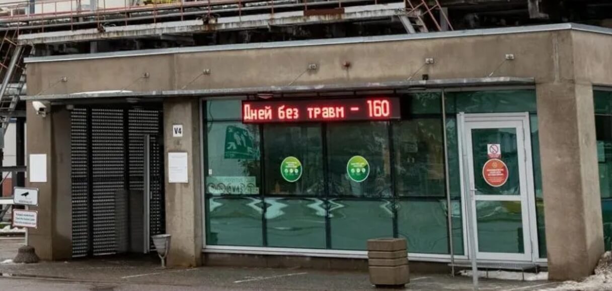
Detail from a photo by Eero Vabamägi (hope this is acceptable use).
Changelog
28. March 2026
Version 0.7
v0.7 does a lot of things to work around the absolute abomination that is ENTSO-E API. It's throwing 503s whenever it wants (it's not like a maintenance/release window, it's happening constantly), it returns partial data, some batches are missing etc. This totally messed up
market tab charts - there're times when Finnish import is missing, but export to Latvia shows (messing up the net flow), Auvere data is missing, but aggregated to rest of oil shale blocks and so on. The new version switches to more graunular data blocks (weekly instead of monthly), adds block retries and fallbacks, but I'm sure there are cases even this does not help.
9. March 2026
Version 0.6
v0.6 adds predictive model showing probabilities of survival over period of time. The counter starts from the previous UMM with status BROKEN, not with the last red day on heatmap. This is a bit counterintuitive, but look at the tooltips on heatmap - for example, it's a common case for BROKEN status to end and then MAINTENANCE ticket is logged for startup procedures.
Also switched to weighted average algorithm when calculating days' statuses on heatmap.
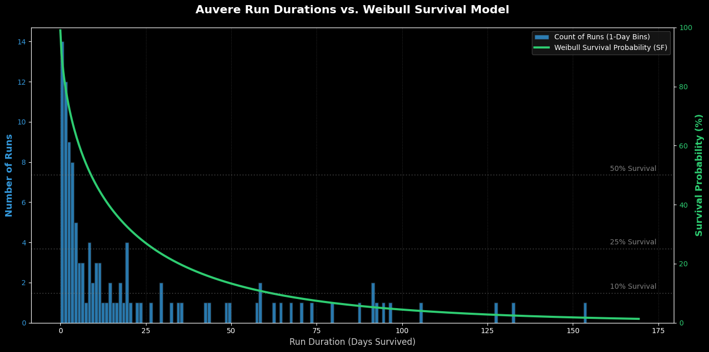
The above plot illustrates the Weibull distribution used for predictive model. It plots the days survived on x-axis, count of runs with that many days and the Weibull survival function fitted over the 10 year data.
8. March 2026
Version 0.5
v0.5 feels like the first stable release. Added Market tab. Fixed some bugs, tuned some algorithms. The algorithm that is calculating streaks was heavily affected by rapid fire of UMMs that come with outages, sometimes there are very short delays in between that break the streaks and bring averages down.
I know the numbers have been changing one way and the other way and that is not good in the trust business. But then again, every iteration I've made feels more fair than the previous - regardless of in what direction the numbers change. It's not my intention to make things look good or bad, my intention is to provide as accurate info as I possibly know how to provide.
And there is a lot of nuance to it, there always is when you dig deep enough.
4. March 2026
Version 0.4
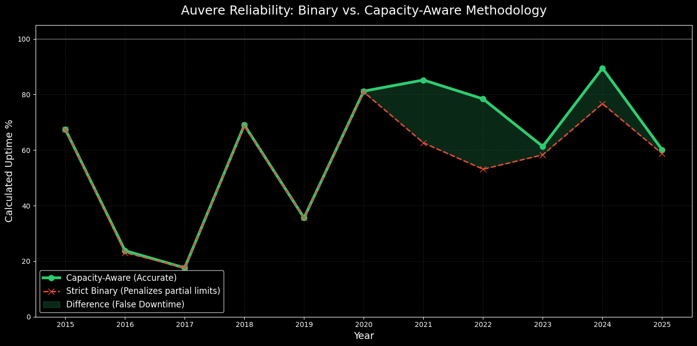
Status algorithm overhaul. The previous algorithm looked at UMMs (Urgent Market Messages) and painted the period red for a BROKEN status, yellow for MAINTENANCE, and green for uptime. This penalized the station whenever a UMM was logged, even if capacity was only slightly reduced.
I decided to ditch the BROKEN/MAINTENANCE distribution and make the algorithm capacity-aware. The new mapping is:
- Green: Full capacity (≥ 250 MW)
- Yellow: Reduced capacity (50 MW to 249 MW)
- Red: Not operational (< 50 MW)
The max capacity stated in a UMM is like a speed limit on a German highway: if there is no limit, you can go as fast as your plant allows (Auvere is capped at 274 MW). If there is a limit, your actual generation can be lower, but you shouldn't exceed the limit. It is strictly an upper bound, not what the station actually generates at any given time.
We are looking at periods when this upper limit is set, as that invariably means there is a problem. I tuned the ranges to allow for normal fluctuations (260 MW is still fully operational). The cap rarely drops below 50 MW without hitting 0 MW—33 times to be exact. Since anything under 50 MW is below the boiler's minimum stable load, the plant is functionally offline at that point.
I expected the differences between the algorithms to be larger, meaning capped operation is less common than I thought. Regardless, the capacity-aware algorithm is a significant improvement. Here is a graphical representation of the differences:
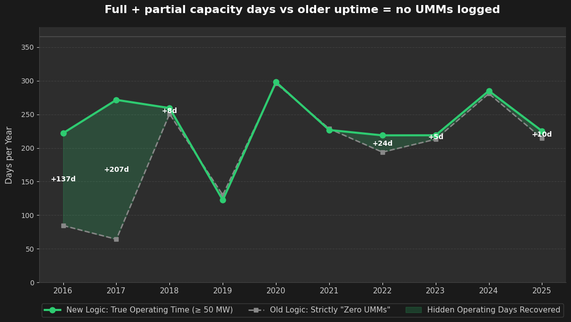
The gap at the beginning represents the period when station output was capped due to dust emissions (check heatmap tooltips for detailed info).
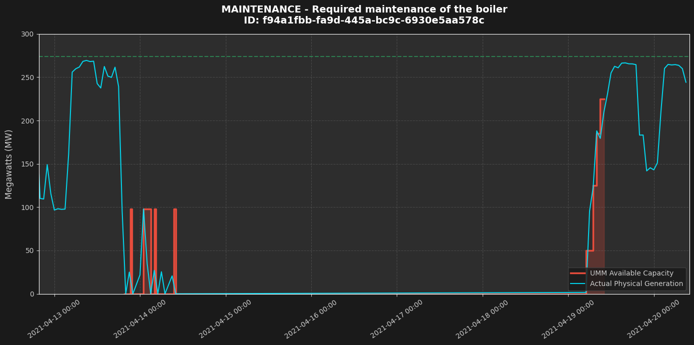
There is also an interesting plot from testing the new algorithm. It shows the station tripping, a few attempts to restart at a 100 MW cap, a maintenance period, and a stepped startup. My initial algorithm used only the very last UMM in a chain (here setting the cap at ~225 MW), which masked the initial downtime and made the station look considerably better. Tracking the exact steps exposed the reality.
Smaller things: reworked the maintenance messages panel and the aggregate stats to fit the new calculations. Not entirely happy with it yet, but I want to push the status overhaul out and deal with smaller adjustments on the fly.
1. March 2026
Version 0.3
During maintenance with reduced capacity (plant partially working), pie chart with actual production is still shown. Added comparison and changelog pages.
23. February 2026
Version 0.2
v0.2 was the first version to actually experience Auvere outage (I don't have any test data) so multiple issues were fixed on the fly when maintenance started. v0.2 uses the 12:00 status check only for heatmap which I consider good enough, averages are based on actual periods (uptime is broken by 2h restart in the middle of the night). Added yearly status breakdown to show if the plant is improving or not. Added lifetime stats pie chart. Added ongoing and upcoming maintenance messages. There is a known deficiency which makes uptime figures worse - in some cases maintenance messages are logged when plant is operating at reduced capacity - current algorithm still counts it as downtime (but then what should be the threshold?). The difference is shown on the graph below (the capacity-aware approach uses 50% threshold).
17. February 2026
Version 0.1
v0.1 used the following algorithm for heatmap and stats: if the plant is up at 12:00 (no maintenance messages logged that cover 12:00), the plant is considered to be up for the whole day. This caused significant skewing of averages and streaks (you might notice this in early screenshot published on kroonika.delfi.ee).